

As a UI design exercise, we were asked to redesign an existing application, focusing, not only on the aesthetics but also on its functionality and heuristic principles.For this project, I decided to go for the SoundCloud app, a brand that I personally love but whose actual application could be widely improved.
Unlike other music streaming services like Spotify, SoundCloud offers a very accessible opportunity for new or amateur musicians who want to upload and share their creations online.
There is a strong community aspect in SoundCloud that permits you to connect with other creators and your personal fandom.
Having your personal profile, following your other creative friends, and being able to write personal messages is an essential part of the Soundcloud experience, and what differentiates it from other music streaming services.
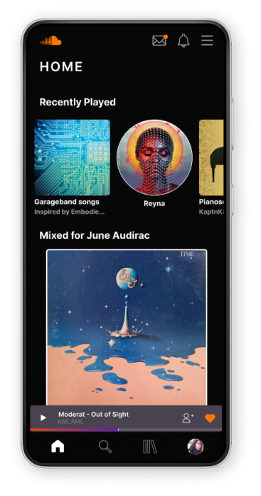
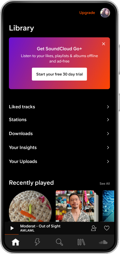
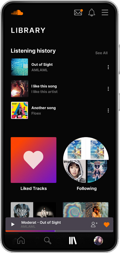
However, this is not reflected in their application, where even accessing to your profile page becomes a tedious four-step task.
I focused on making the profile page more accessible, while fixing some heuristical problems I found when analyzing the UI of the app.
Among these were:
Doing these changes came in hand with giving the app a subtle but visible change, making it look cleaner, spaced, and organized.
Take a look at the
To read the detailed version design process of this project